

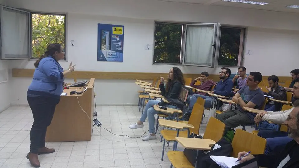
A slide may look elegant on the speaker’s laptop and become impossible to read from the back of a classroom. An accessible presentation checklist helps students and trainers design slides that are easier to follow in different learning conditions. It is a practical beginning, not a formal accessibility certification or a substitute for testing with actual users.
Featured image: Shani Evenstein (שני אבנשטיין) · CC BY-SA 4.0 · Source
The examples are illustrative. A learner might prepare five slides explaining a basic business idea, while another uses them to demonstrate a digital skill. In either case, the real goal is to make the information understandable rather than decorate every available space.
Decide what the audience needs to learn
Before opening slide software, finish the sentence ‘After this presentation, the learner should be able to…’ Choose one modest outcome. Organise a few supporting points in a sensible sequence. A slide deck cannot rescue a lesson whose main purpose is unclear.

UNESCO’s inclusion in education resource highlights the importance of education that responds to varied learner needs. For a classroom presentation, that means considering the people who must read, hear and use the material, rather than assuming a single viewing condition.
Use headings that explain the message
Replace labels such as ‘Overview’ or ‘More Information’ with headings that describe the idea. Put one main point on a slide and arrange supporting detail below it. If a slide holds an entire essay, consider splitting it or providing a written handout instead.
Illustrative example: A slide originally titled ‘Costs’ becomes ‘Transport and packaging affect the final price.’ The revision tells learners what to examine and helps the speaker stay focused. This is an example of clearer communication, not proof that one title will suit every audience.
Check readability in the actual room
Use a font size that remains comfortable from a realistic viewing distance. Avoid tiny text, tightly packed paragraphs and labels sitting directly over photographs. Test contrast and avoid relying on colour alone to communicate a warning or a category. The room’s brightness and screen quality can change the result.

A red and green chart can be unclear to some viewers even if the designer understands it. Add direct labels or patterns, and explain the main comparison in words. No universal visual choice guarantees accessibility; careful testing is necessary.
Make images informative and responsibly credited
When a picture carries essential meaning, describe that information during the presentation and provide a suitable text alternative in materials that support it. Use illustrations you created or pictures with permission for reuse, observing licence credits. Remove decorative elements that make important content harder to see.
Illustrative example: A student shows a simple chart of invented monthly sales. The accompanying statement explains what the bars represent and acknowledges that the numbers are hypothetical. A viewer should not need to distinguish five similar shades to understand the message.

Check navigation and shared files
A presentation may be viewed on a phone, laptop, projector or as a shared document. Test whether headings, links and graphics remain understandable in those forms. Where supported, use meaningful document structure and check reading order. Do not treat exporting to a PDF as automatic proof of accessibility.
UNESCO’s digital education work concerns using technology in real learning contexts. A practical lesson here is to test the format that participants will actually use, not just the version visible on the creator’s computer.
Offer learners more than one route to the information
Consider sharing a concise written summary or appropriate notes where practical. Speak aloud the important meaning of visual material rather than saying only ‘as you can see’. Let people ask clarifying questions in ways that suit the class. For an online session, check that essential information is not lost through a poor connection.
The ILO practical guide to blended and digital training offers a structured approach to designing learning activities across formats. It supports the idea of planning for delivery conditions, though it is not a technical manual specifying slide colours or exact fonts.
Ask someone to test your presentation
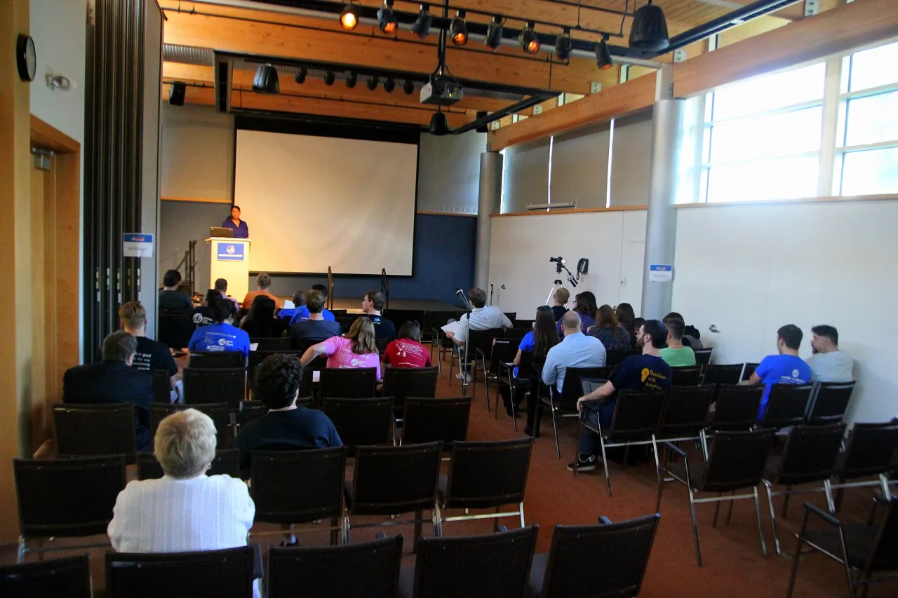
Give a classmate the learning objective, then show the deck without explaining where to look. Ask them what the important point was, where they became confused and whether the graphics helped. Revise one or two significant issues and test again. Avoid treating one friendly response as evidence that every learner will find the slides accessible.
G-Learning Center’s Performance Management and Managing a Successful Business are real course subjects where learners may practise clear presentations. Always check course pages for current details.
Keep a clear final checklist
Before presenting, confirm the objective, useful headings, readable text, adequate contrast, labelled graphics, credited images, and the availability of an alternative explanation where necessary. View the final file on the intended device. Keep a copy of the revision notes to show how the presentation improved.
An accessible presentation checklist is valuable because it directs attention to the people receiving the message. A simple deck that learners can follow is more useful than a visually elaborate one that leaves them guessing.